Interview by Stacey Freed

Net Assets: What are your general suggestions for how independent schools should use their websites for enrollment management and targeted recruitment and retention?
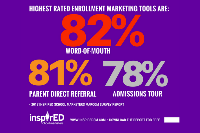
Liza Fisher Norman and Rob Norman: First and foremost, it’s critical that schools dedicate the front-facing (i.e., not behind password protection) portion of their website to marketing. Word of mouth is a school’s number-one marketing tool. The website is number two. When prospective families arrive on your homepage, they should be able to garner answers to the following questions:
- What problems are you going to solve for my family? The family may have “pain points” that they hope a new school will relieve. Maybe their child needs a smaller classroom environment, or to be among children whose families share similar values, or to be more challenged, or get more personalized attention, etc.
- What makes this school different from other, similar schools? This, in a nutshell, is the school’s brand and should be front and center on the homepage. Some schools put this under “Why [Leaf Academy]?” but your messages should permeate the entire website, starting with the home page.
- What does this school stand for? If this prospective family were to become a part of this community, do your school’s beliefs align with theirs? Can this family (student and parents) see themselves there?
- What is this school? This seems obvious, but we’re always surprised at how we have to hunt to find a school’s baseline description on many websites. In the footer (our preference) or on the homepage somewhere, state whether the school is private/independent, is religiously affiliated, has a special focus (such as LD, Montessori, Waldorf, etc.), is coed/single sex, what grades it serves, the physical address and general contact information.
Should there be calls to action? Interactive sections? Video? How should they be presented?
There should be calls to action on the homepage, but “Apply Now” shouldn’t be the only one. This puts the cart before the horse. On a first visit, families want to “Learn More.” They’re thinking about going out on a date, not getting married. So give them a dating option.
An interactive viewbook is a good option for some schools. This is a link from the homepage to a robust section of the website that takes a deep dive into the school experience. Some schools’ interactive viewbooks totally replace any traditional printed ones or serve as accompaniments to much smaller printed versions that drive families to the website. We like the viewbooks of Newark Academy (New Jersey), North Shore Country Day School (Lower, Middle, High) (Illinois) and Gilman School (Maryland) as examples. In the InspirED 2017 Private School MarCom Survey Report, only 7 percent of schools said they believe their printed viewbook is effective, and yet 72 percent said they produce one.
Video is big on websites now. Where you once saw a large banner image on a school’s homepage that might rotate through several images, you now often see video clips that do the same. They generally don’t have sound, but they are effective nonetheless in making the visitor stop, look and get a taste of the school. What are the kids wearing? Do they look happy and engaged? What does the campus look like? Is the atmosphere formal or informal? How do students interact with teachers and vice versa?
Video is also big on websites for sharing positioning the school, student profiles, a glimpse of what teaching looks like or parent testimonials. Photography and video are incredibly important in portraying a school’s brand, and schools should invest in professional photography/filmmaking as much as their budget will allow. Not everyone reads all the copy, but everyone sees the images, and many are visual learners. We wrote a two-part blog post about the value of professional photography at go.nboa.org/InspirED-photog.
What are some other schools that you think are doing a great job in this area?
Besides the examples we’ve already mentioned, some other sites we like include Presbyterian Day School of Memphis, Westminster in Atlanta, Georgetown Visitation in Washington, D.C., Montclair Kimberley Academy in New Jersey, Marin Academy in California and Stuart Country Day School of the Sacred Heart in New Jersey.
Photography and video are incredibly important in portraying a school’s brand, and schools should invest in professional photography/filmmaking as much as their budget will allow.
How does a school know whether what it’s doing on its site is working — for instance, in enrollment management and targeted recruitment and retention?
Private school marketing becomes more sophisticated every day. Schools should no longer be guessing what their audience wants, who their audience is, where their audience comes from and how it behaves (or you want it to behave) in the enrollment process. Data is king, and website analytics are free to all schools through Google. That said, reading, comprehending and acting on analytics is no small task. It would be ideal if the school can afford to have someone on staff who specializes in this area, but most can’t. Options include hiring a consultant, using your web developer or employing software such as Hubspot to support informed decisions about marketing strategy. BlackbaudK12 has some good podcasts about how to drive traffic to your website your data.
Is a school’s homepage only for external audiences?
No, the homepage is a critical tool for retention as well. Current families need to be constantly reminded why they chose the school in the first place, what they love about the school and how their child benefits from attending. By seeing the school with “fresh eyes” through the marketing lens, they will be reminded of the reasons for their choice and be affirmed in their decision.
For best results should sites be designed to reach parents or students?
It depends on the age of the student. In focus groups, we hear parents say they let their child make the final choice for their school as young as first grade, but we don’t think that age group is poring over the website for information. Middle schoolers and up are going to access the website for information, so there should be content that is particularly interesting and appealing for them so that they can picture themselves as part of the school community.
What are the biggest mistakes you see on school homepages today?
Besides the big one — not ensuring the homepage is focused on marketing — I am dismayed to see truly old websites that haven’t been redesigned in the last few years as well as sites that are not responsive (work properly on all devices such as phones and tablets), have 10 or more dropdowns from the main navigation, have poor navigation, are not branded (“small classes, dedicated faculty, educate the whole child, create a life-long love of learning, and community like family” are not differentiators), and have poor visuals. It’s important to think of the user experience. Think like a visitor and give them what they came looking for, solve problems for them, answer questions before they ask them and position the website from their point of view. This does not mean pushing information out from the school’s point of view, but drawing the visitor in with information they can use.
How important is blogging to the retention mission?
Blogging may be a good retention tool if your audience engages with it. For some parents, listening to a podcast might be a better option than a blog for convenience and ease of use. The school needs to survey its parents to learn what they say they want, and then track to see what they actually do. But the point of a blog or a podcast is to give current (and prospective) parents in-depth information about the school and/or their child’s experience that they aren’t getting elsewhere.
Liza Fisher Norman and Rob Norman are partners in InspirED School Marketers, a web-based community offering a broad array of professional development resources and ideas for school marketing professionals, including the 2017 MarCom Survey Report, podcasts, webinars and more. Previously, in her 25 years as principal of Turnaround Marketing Communications, Liza worked with dozens of schools on brand development and marketing.
Download a PDF of this article.


